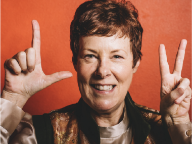
Cindy Okroj reached out to me in the fall of 2018, desperate for a site that wouldn’t break. She actually really liked her old site, but every time WordPress or a plugin was updated, she felt like something went awry and it was costly to continually repair her old site with every update.
Even the developers she worked with kept telling her it was time for a new site. When she could no longer update anything “in case it ‘broke’ again,” she finally listened to her developer’s advice and began the search for a new web designer.
And, I feel SO blessed that she found and chose Entwine Web Design to design and develop her new site.
Step #1 – Discovery
Cindy is a lovely woman who had a successful career in nursing, but after having to deal with her own health issues, she began to explore new ways of healing and working with energy to heal her own health issues.
This led her to learn a variety of energy healing modalities upon which she has built her business, YourBonAccord.com. She ran her business on her old site for years, until she realized that besides her site breaking, navigating her site was difficult as she had kept adding and adding more pages and services through the years without any strategy behind it. There were over 20 elements in her main menu. It was also confusing as to exactly how to hire her.
As we began working on her project, we talked a lot about what she loved with her current site and what she wanted for her new site. Her offerings needed to be streamlined and updated. We needed to focus on her main goal of getting visitors to schedule appointments with her. And she also wanted to have a way to educate her visitors on each of the healing modalities she used.
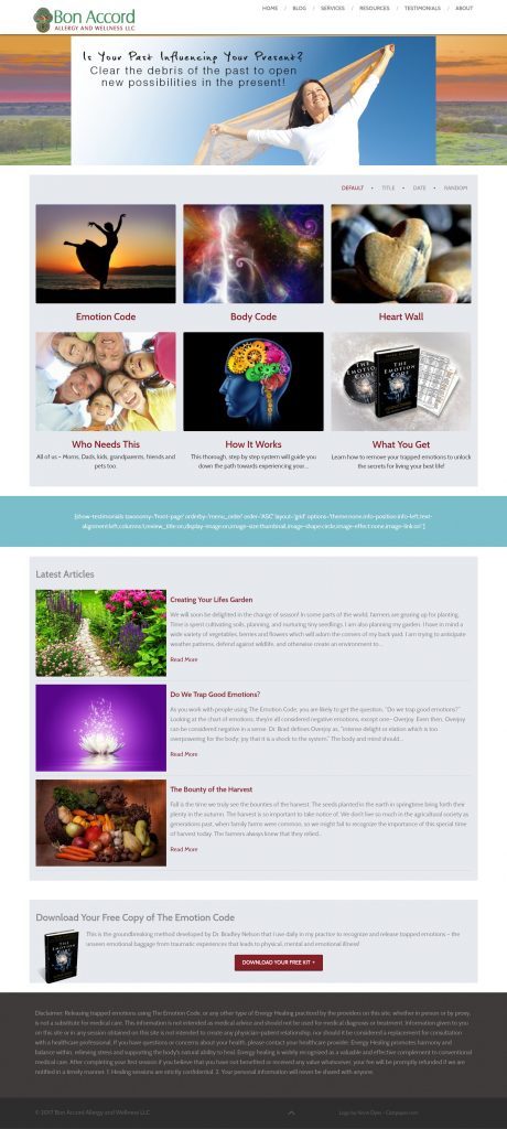 Cindy’s Old Homepage – lots of color and education but not ONE link to schedule an appointment with her.
 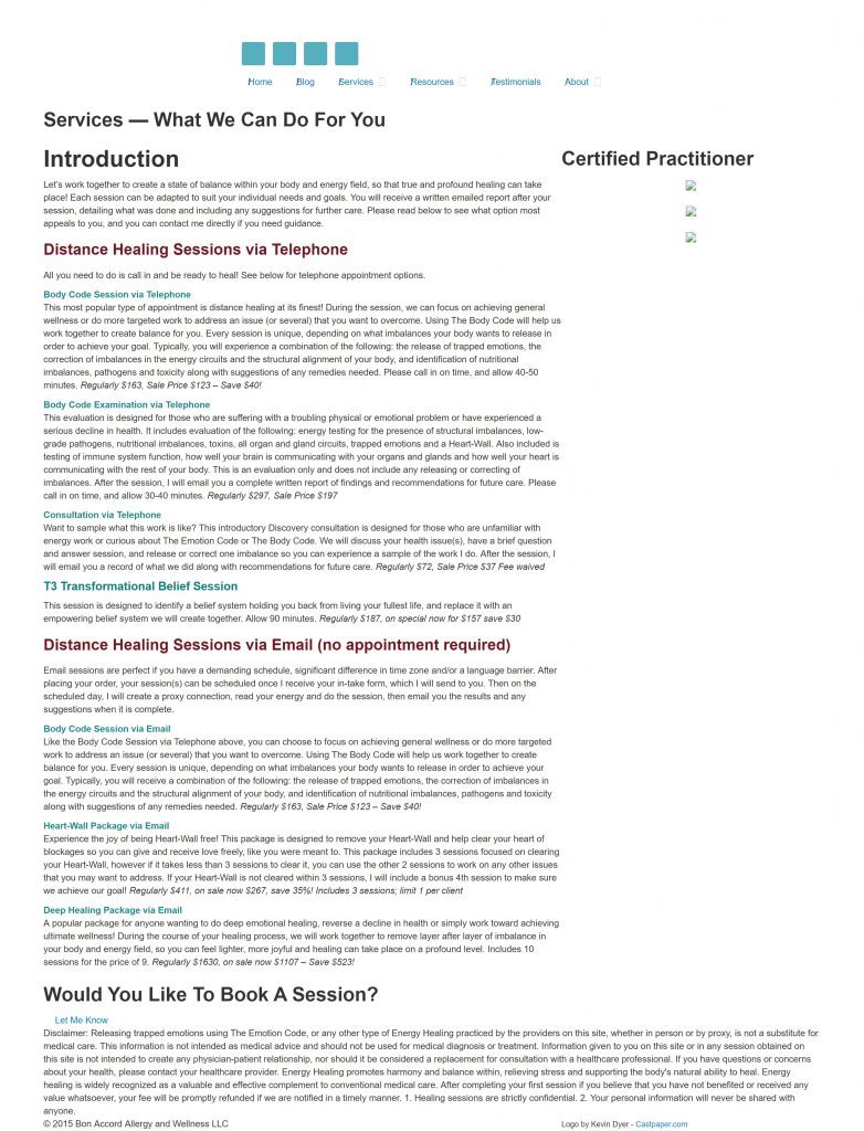 Cindy’s old services page which was a wall of text with no images to break it up and broken image links. This is SUPER hard to read, especially on mobile.
Educating her visitors was a big piece for Cindy. She wanted to keep all of her explanations of each of the healing modalities she uses. On her old site, she had them all as separate pages in a drop down. On her new site, we added them as blog posts, so they could be categorized and searched which is a much more user-friendly way to provide educational content.
As a former educator, I call myself a website “coach” because I do a lot of training with my clients as to the how and why behind the decisions that we’re making together. She agreed with the restructuring of her content and said, “Amy had an educational approach which taught me how to deal with aspects of web design/development that I was less comfortable with, including the importance of branding, identifying the ideal client, and SEO.”
Step #2 – Inspiration
Cindy is a beautifully joyful woman with an easy smile. She loves flowers and light. But, we discovered that when it comes to websites, she does not like much white space! As she shared images and patterns that she liked, they were all saturated with color but also had a lightness about them.
She loved background patterns but not backgrounds that were too dark. All of the colors that she liked were bright and buoyant – not sure if that’s a great word to describe color but it’s how I think of Cindy – she’s uplifting. So combining these elements into a cohesive feel with her current logo which is a Celtic style oak tree in rich deep hues whole was one of the challenges of this project.
Step #3 – Design
The design phase took several rounds of revision for us because Cindy had a hard time visualizing how the elements on her brand board would look/translate in the actual web layout.
She had approved both the layouts and the branding, but when these two were combined into full-color mockups of her main pages, she found she didn’t like it…at all. And this is where the beauty of a collaborative multi-step process comes in.
I hadn’t built anything online yet. I had full-color mockups in Adobe Illustrator that were super easy to change and make sure that they were right before we got online. She was super nervous to tell me that her first response to the mockups was a feeling of disappointment, but for me, that’s actually good. I would so much rather have a client tell me we’re not there yet so we can keep working than hand over a site that a client isn’t’ 100% thrilled with. Yes, this can take longer and yes it can be scary for a client to tell they’re designer that they aren’t happy with it, but that’s the point of a collaborative process where the client approves design elements every step of the way. And, it’s actually what designers want!
Once we got the layouts and branding completely in alignment through several revisions of the final mockups, it was time to build the site.
Step #4 – Development & Launch
This is where the client gets to sit back and relax while I dive in and actually build their website. Cindy’s site turned out beautifully. It was a large site with a ton of content that we streamlined and reorganized. Her navigation went from 20+ items in drop downs to six items, and we achieved her goal of a site that is much easier to navigate. We also focused every page on her goal of getting visitors to get to know her and schedule with her.
One of my favorite elements of Cindy’s new site is her footer which I realize isn’t the most exciting part of a website, but the image in the footer was one of her favorites from her old site. So, I made sure it was on every page. I love the sunset in the background, the glow-y feel it provides, and the feeling of grounded-ness or solidity at the bottom of every page. It’s just lovely and makes me happy when I see it as it’s such a reflection of Cindy.
Warning: count(): Parameter must be an array or an object that implements Countable in /home/customer/www/entwinewebdesign.com/public_html/wp-content/plugins/ultimate-responsive-image-slider/layout.php on line 15
Cindy Okroj

“Amy brings a delightful creativity in her approach, as well as practical suggestions to improve site content, flow, and helpful elements for the potential client. Amy also is an excellent writer and was able to make suggestions that were so valuable, improved copy flow and presentation. Amy is also very organized. Working in a step by step fashion was huge in helping me not be in total overwhelm about the process. I knew what was needed and by when every step of the way. At one point I was feeling very frustrated, after I had approved some of the designs but ended up not liking the result. I shared this with Amy and was worried about how that would make her feel or how it would impact the process. I LOVED her response that she would not be happy until I was which made me feel so much better. We took a few steps back and made adjustments until I was thrilled with the design. This alone was priceless! I loved working with Amy and am delighted with the new site. It is easy to navigate, easy for new clients to find out how to schedule my services, and easy to do what I need to do on the ‘back end’. I highly recommend choosing Amy and Entwinewebdesign. I am confident you will have a fabulous experience, as I have had.”
Cindy Okroj | YourBonAccord.com
