With every new custom brand and web design project comes one of my favorite challenges – creating all of the visual elements that will be both distinctive from every other brand out there AND reflective of the essence of the business and personality the brand represents.
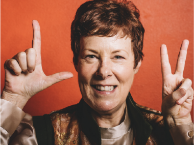
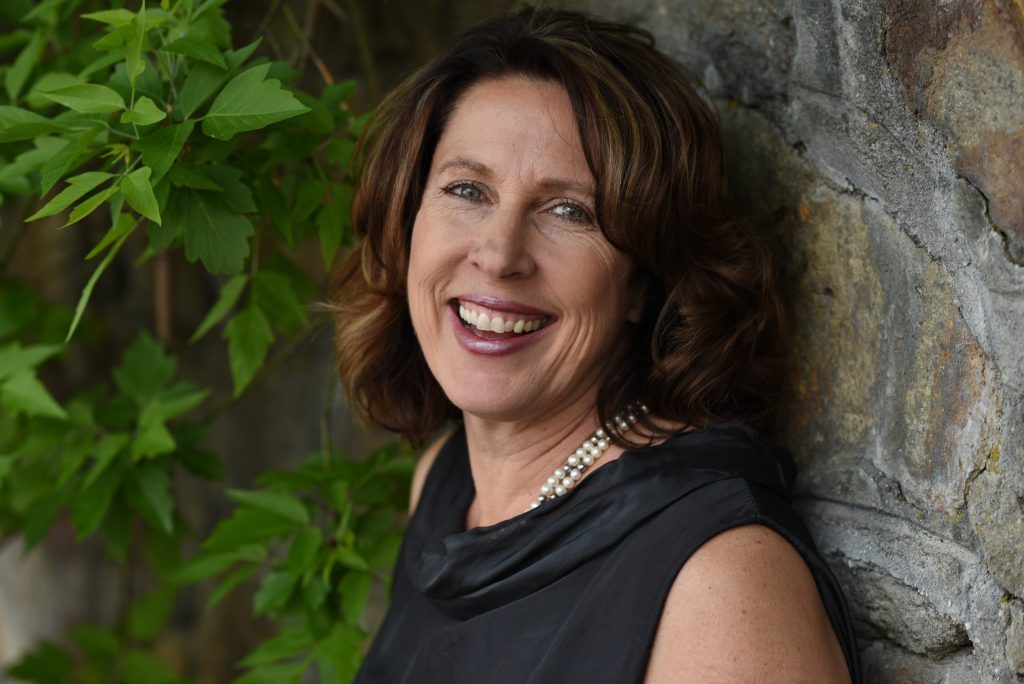
Jamie Metz’s branding and website design project is one of my favorite projects because her branding has so many elements that are distinctly “Jamie,” a brilliant woman whom I’ve had the privilege of knowing for years.
She coaches professional women and organization leaders who feel unfulfilled or unsure about what’s next despite a successful career. She reached out to me because her current site was out-dated, and the design didn’t reflect her at all. She wanted to use her website as part of her marketing to grow her business, but “was embarrassed by it.”
Here’s are two shots of Jamie’s site prior to our work together:
Step #1 – Discovery
We started Jamie’s project with research. She filled out several questionnaires and also pulled together a Pinterest board for some visual inspiration. Her current site, shown above, reflected her love of hiking and the outdoors but it didn’t capture her passion for creating a safe place for women to dream, expand, and grow which is Jamie’s strength.
One of Jamie’s big goals with this project was to add to her offerings and highlight the work she does with executive leaders in the corporate world as well as grow that area of her business. She also wanted to streamline her offerings and write copy that clearly conveyed her strengths and her working style.
Crafting her copy was perhaps the biggest challenge for Jamie throughout the process as it requires clarity and brevity. She knew what she wanted to say, but she struggled to capture it in her voice without making it too long, so we had several copy conferences to support her in that regard. The most beautiful design won’t work without clear messaging, so drilling that down early in the process is key to a successful project.
Step #2 – Inspiration
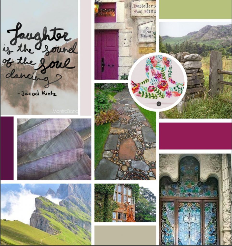
Jamie did a fabulous job capturing images and visuals for her Pinterest board. She selected images and thoughts that clearly conveyed her values to encourage women to explore their options, embrace change, and confidently move into the next level of possibility for themselves. Her board was filled with images of rocks, paths, gates, and mountains, elements that convey both possibility and strength.
We also talked quite a bit about Jamie’s love for walking and hiking. She’s hiked the Camino trail in Spain and also trekked across Scotland. I wanted to capture that without images of hikers as that doesn’t really convey her coaching style. When I discovered that a scallop shell is the symbol on all of the trail markers on the Camino, it became a subtle yet meaningful symbol for her work as a guide and mentor.
She chose the following inspiration board from three different options:
From there, I created three separate brand boards that with a variety of fonts and textures. Some clients sit back and take their time considering the options, but Jamie knew instantly which resonated with her. In that sense, she was a dream client – getting back to me quickly with her opinions and feedback.
Next, we finalized her brand board which included her fonts, her colors, and textures. We did not recreate a logo as she already had one that she really liked.
Step #3 – Design & Development
Finally, Jamie sat back, her work done except for providing feedback on the page wireframes and mockups, and I got busy designing and building her site.
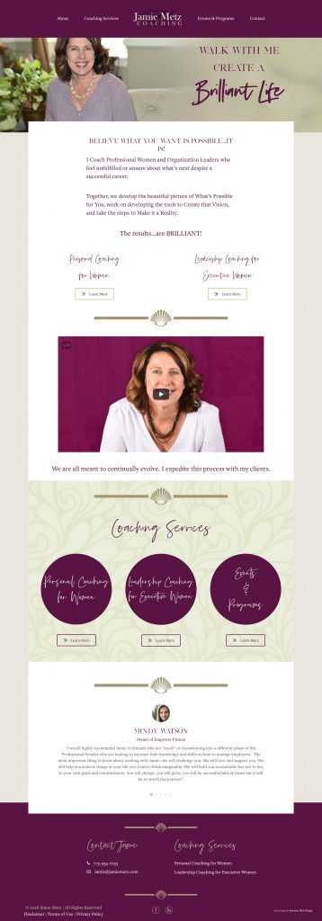
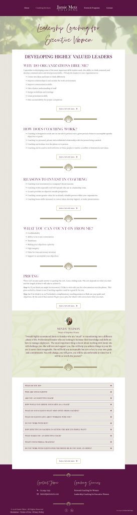
In the design, I knew that I wanted to somehow convey the idea of a path as almost all of the visual elements that resonated with her showed gates, paths, and mountains. I did this by making the header and footer full-width, but the content sections have a fixed width and overlap the header and footer a bit to give the feeling of a path.
We also used the scallop shape to delineate different sections of each page, guiding a visitor down the page just as the scallops guide a hiker on their trek across Camino. The camino is surrounded by two “path” lines.

These are subtle design elements, but it’s so important to create a design that not only looks great but that somehow conveys the values and passions of the site owner.
Jamie is now “proud of my website and feel that it represents me well.”
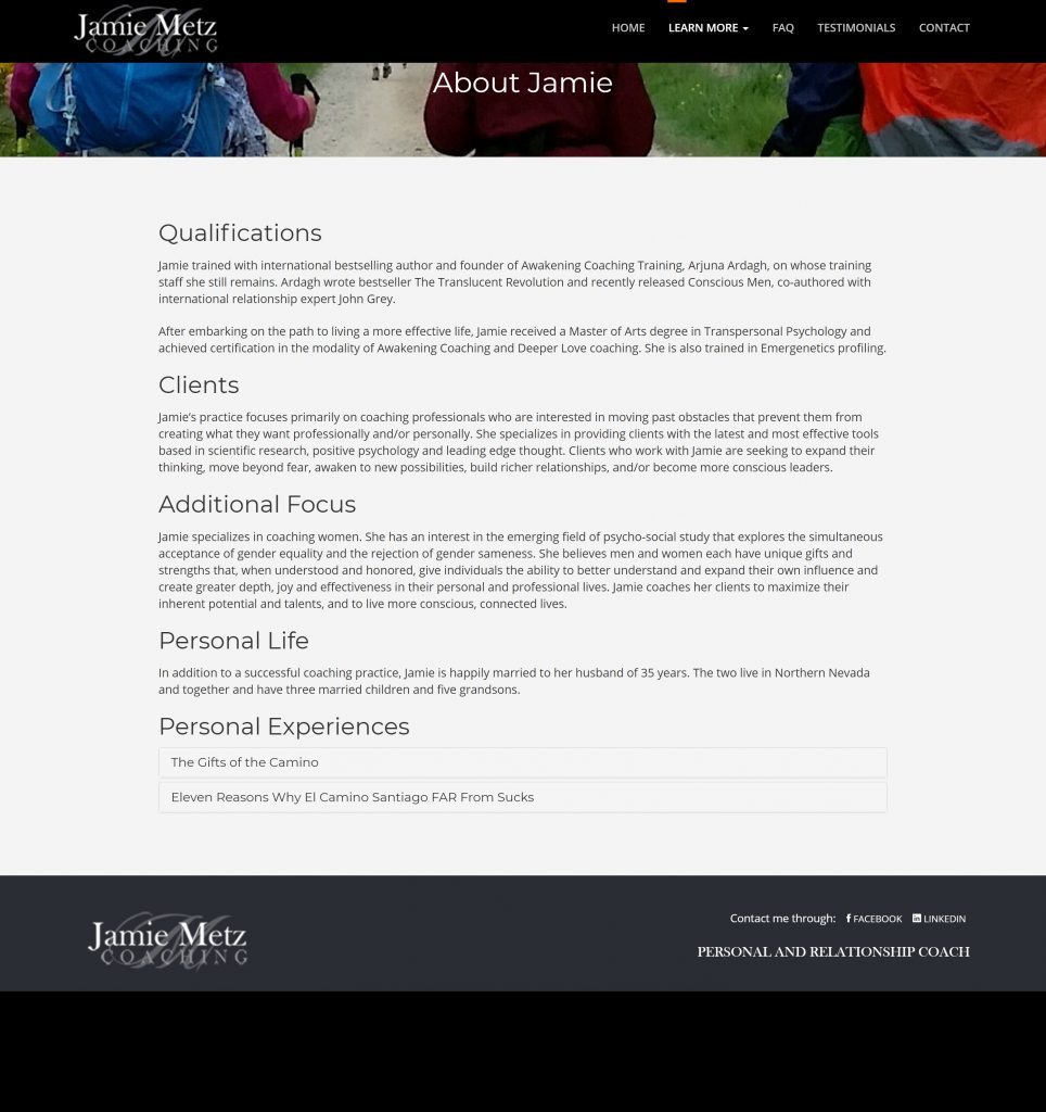
Jamie Metz Coaching homepage:
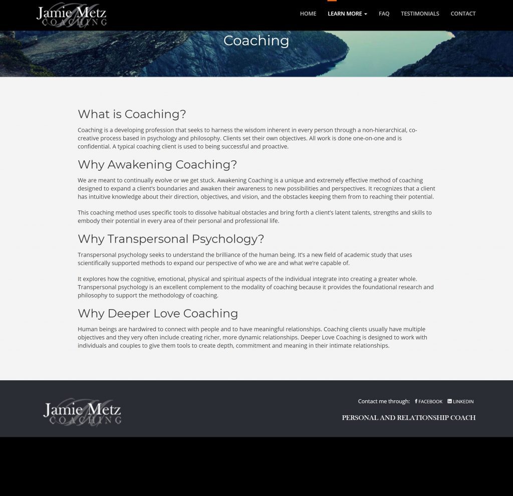
Jame Metz Coaching – Leadership Coaching for Executive Women page:
 “Before I started working with Amy, I was embarrassed by my website. It was out of date, didn’t fit me, and was not well designed. When we started working together, I was excited because I’ve always thought Amy was brilliant and creative. I also loved that she pushed me and gave me honest feedback. At the beginning I felt overwhelmed by the whole project and the tasks that I had to do, like write my copy, which was hard because while I can talk all day about my business, my coaching approach, and my successes with clients I had a difficult time articulating what my business does in the shorter written format that website copy requires. I had to learn to go through all the steps and trust the process and Amy because she cared about getting it right and giving me a website that represented me.
Now, I am proud of my website. I can send people to it and feel that it represents me well. Amy made sure I had a website I love. I appreciated that.”
Jamie Metz, Jamie Metz Coaching