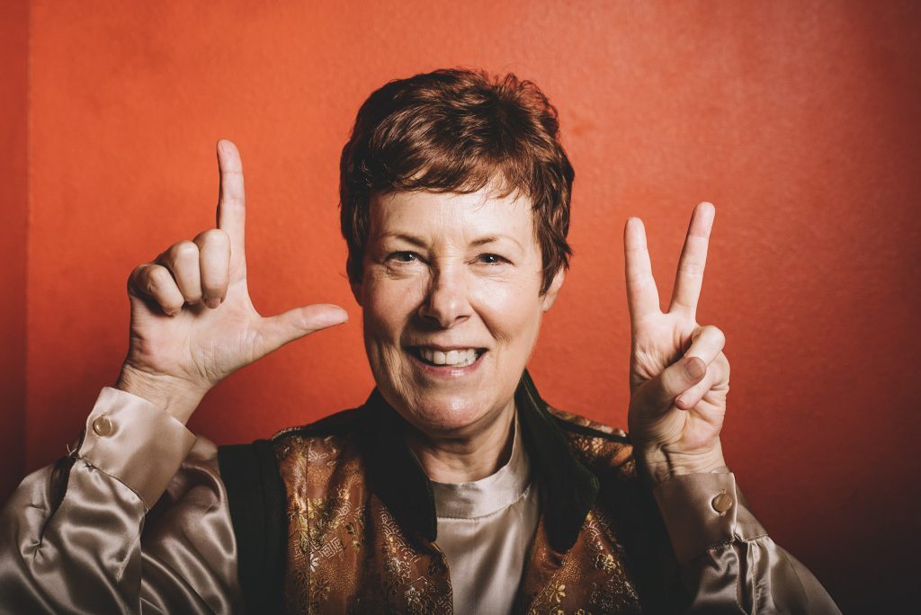
For my final custom design and build project of 2018, I had the honor of working with a teacher and mentor of mine, a woman I’ve admired and learned from for a decade.
I first “met” Janet Conner when I ordered and read her book, Writing Down Your Soul. This was in 2008 or 2009. At the time, I’d started meditating and found it super hard. A friend suggested that I try journaling rather than meditation to calm my racing brain.
I found Janet’s book which is decidedly NOT about journaling in the traditional sense, and I loved it. She teaches deep soul writing and getting into a meditative state as you write in order to access your inner wisdom.
After finishing her book, I got on her email list and enrolled in one of her early courses. . I’ve since read her books and taken quite a few more courses. Through the years, she’s not only been my teacher, but she’s also become a friend and mentor.
When I first thought of launching Entwine Web Design as a business, I was taking Janet’s course on The Lotus and the Lily that’s based on her book by the same name. I knew that the course was filled with loving, soulful women, many of whom were coaches, writers, and speakers – exactly who I wanted to work with.
I emailed Janet and asked her if she would mind if I offered my new services to her group. She graciously agreed and that’s where I landed my first two clients ever, and I couldn’t have asked for more amazing people to work with out of the gate.
This year, I was so honored when Janet asked me to re-create her website which was dated and no longer reflected the direction she had taken in her life.
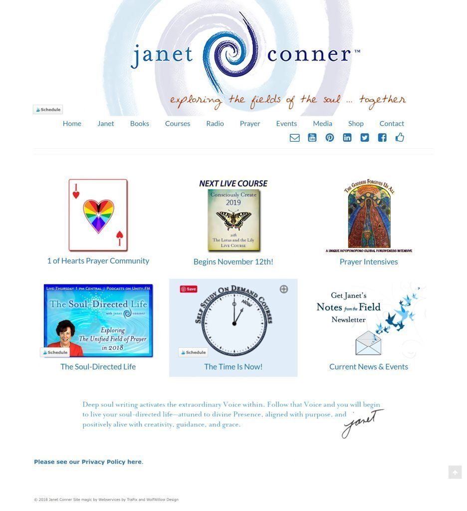
Her old site didn’t work on mobile as it had no menu on phones and tablets. The whole thing was also clunky and out-dated with a variety of visual styles mixed together.
Her messaging and visuals lacked cohesion, and the whole thing was a little confusing. Here’s her old homepage:

Finally, her old site had nothing to do with prayer while her new site redefines prayer and offers a new understanding of this sacred practice. She had a ton of great video and information on her old site, but it needed streamlining and organizing as you can see on her old prayer page.

Her branding and messaging all needed an update as well as the back-end technical pieces of her site which had become quite challenging for her team to keep updated.
Step #1 & #2 – Discovery & Inspiration
The first step in any web design project is diving into a client’s goals for their site as well as the personality and visual elements of their brand. Since Janet and I have known each other and I’ve followed her work for years, this step went incredibly smoothly.
Janet started her website when she was writing and focusing on teaching courses related to each of her books. However, she has since transitioned into an entirely new role as a Prayer Artist where she explores the mystical side of life through prayer.
To achieve this, Janet and I had lengthy conversations about what she does and the vision and feel she wanted for her new site. I have pages and pages of notes from these conversations and often would make quick sketches while Janet was talking.
We kept most of the videos and audios as they’re a treasure of information, but the mish-mash of everything else she had on the pages needed to be streamlined both visually and structurally throughout her new site.
Steps #3 & #4 – Design & Development
For her new site, we added a blog as she wants to increase traffic and reach more people. Janet is a prolific writer who writes a lengthy newsletter each week. These are now doing double duty as blog posts to help with SEO and driving traffic to her site.
We also added a video pop-up in the header of her homepage to introduce visitors immediately to who she is and what she does.
The focus of her old site was her books but we have switched the focus to her work as a Prayer Artist. Her books are still on the site and are a key piece of what she does, but the emphasis is now on her Prayer Intensives, three-week courses that dive deep into a specific aspect of prayer, and her upcoming Praying at the Speed of Love Podcast.
Janet has had a successful radio show for years with Unity that has also been a podcast, but she’s branching out on her own and starting a brand new prayer podcast. This new site is also a hub for her new podcast and the blog will provide a home for her show notes, something she didn’t have with her former radio show.
Technologically, her site ended up needing quite a bit more work than we’d originally anticipated as all of the columns and design elements had been hand-coded by her original developer. So every page needed to be rebuilt completely. It was like diving into a remodel and discovering that the plumbing and electrical were shot, but we got it done and the response from her community has been incredibly positive.
Two elements that I especially love are the prayers that are slightly tilted and the gradients on the main pages. I wanted to have an element that was off-center or off-kilter because to me, that’s a key piece of Janet’s work. She lovingly pushes her students out of their comfort zones, and while she’s gentle about it, she’s also uncompromising. She doesn’t apologize for the difficulty of a spiritual journey. Instead, she reaches out her hand and guides you through it until you feel steady and find your feet again.
And, that’s why the prayers are spinning and offset. They’re the visual representation of what happens when you dive deep into your soul.
The next element that I love is the gradient. As you move down the page on quite a few of the main pages, the blue becomes darker and darker because Janet takes her students on deep, deep dive into the mystic.
Janet Conner’s New Site
Warning: count(): Parameter must be an array or an object that implements Countable in /home/customer/www/entwinewebdesign.com/public_html/wp-content/plugins/ultimate-responsive-image-slider/layout.php on line 15
Janet Conner’s Website
Janet’s site launched on December 20, just before Christmas, and we’re both thrilled with the results.

Janet Conner Prayer Artist
Custom Branding & Web Design
“Changing my website was a big scary deal. Because my website is ME. It’s how I communicate with a global audience I have carefully nurtured over the last ten years. The thought of changing it made my tummy tighten. But then along came Amy, and now I wonder why, oh why, oh why, did I take so long to do something so important—and so delicious. I’m in love with my new site and so is my audience. And the statistics! People come and they stay. They poke around until they find something they want to join.
The most important thing I want to tell someone considering hiring Amy is her total mastery of the total process. Before we did anything, she took a lot of time to understand who I am, what I do, and the transformation my audience experiences working with me. She used that information to create a website that conveys the essence of my work through subtle and often unusual design elements, colors, and graphics.
Amy is a very rare creature: equally creative and technical. When there are strange technical glitches—and there are always strange technical glitches—she chases the problem down until it’s solved. And organized! Amy sets up the process in project management software and you know exactly what’s happening, and when, and what you have to approve. Nothing falls through the cracks.
I cannot recommend Amy Isaman and Entwine Web Design enough. She is the only web designer I recommend and I recommend her to everyone.”


