Let me start this post by with a fact: every service-based business needs a website.
When you’re ready to grow your business, a website is a non-negotiable asset, and happily, there are quite a few platforms out there for small business owners to build their own websites, and motivated entrepreneurs create their own websites every day. I love this – that women are getting out there and sharing their gifts with the world.
Here’s the problem, quite a few of their business websites don’t do what they’re supposed to – convert website visitors to clients.
After reviewing numerous websites over the past two years, I’ve found some common mistakes entrepreneurs make when it comes to making their website strategic and functional. If you want to increase website conversions, make sure you’re not making any of the following mistakes.
If your website is suffering from one of these issues, tackle fixing them one at a time.
Problem #1 – Unclear Messaging
Can a visitor tell, in a millisecond, if they are part of your target market? Is it clear what they get when they hire you?
If you never clearly define on your homepage or services pages exactly who you serve or what you do, how do visitors know if your amazing offers are for them?
They don’t.
Remember, good design = good copy. This is honestly one of my mottos.
You can have the most beautiful website, but if your messaging doesn’t connect, your website won’t convert.
To make sure your copy and messaging connect, visitors need to be able to answer the following questions when they land on your website:
1) Who does this site serve (your target market)?
2) What problem do you solve?
3) What do you want the visitor to do next?
4) What do visitors get when they give you their money?
5) Why should they be on YOUR site and not somewhere else?
Look at your homepage and services pages with fresh eyes or have a friend go through your site. If they can’t answer these questions based solely on what they read on your site, it’s time to tackle and revise your messaging.
This post, on writing a clear homepage headline, will help you get started.
Problem #2 – Dead End Pages
You’re in charge of the journey through your website which means that every page should have links guiding your website visitors to where YOU want them to go next.
For example, your homepage should have a link directing visitors to learn more about your OR your services.
Your Services page should have a link directing visitors on exactly how to hire you (see #3).
Every page should direct visitors where to go and what to do next with clear buttons and Calls to Action.
Have you ever gone somewhere and gotten lost? Either on a website or in an actual place? When you’re confused and don’t know what to do, we tend to leave or withdraw. You don’t want this to happen to your visitors. Make your visitors as comfortable as possible.
Problem #3 – No clear path to hire you or purchase your services
This is one of the worst problems I see, especially when your services page is a dead end. Ouch! If somebody is engaged enough that they get to the bottom of your services page but you haven’t clearly let them know how to hire or purchase from you, you’ve got a serious conversion problem.
And yes, I’ve seen this A LOT. Go to your site right now.
On the bottom of each of your services pages, is it totally clear how to hire you? Do you tell people, step by step, what to do? Do you clearly define the process for paying you? Do you let them know what will happen when they do pay you?
Walk them through it, step by step. Your website is for selling your services, so make it easy for people to purchase them.
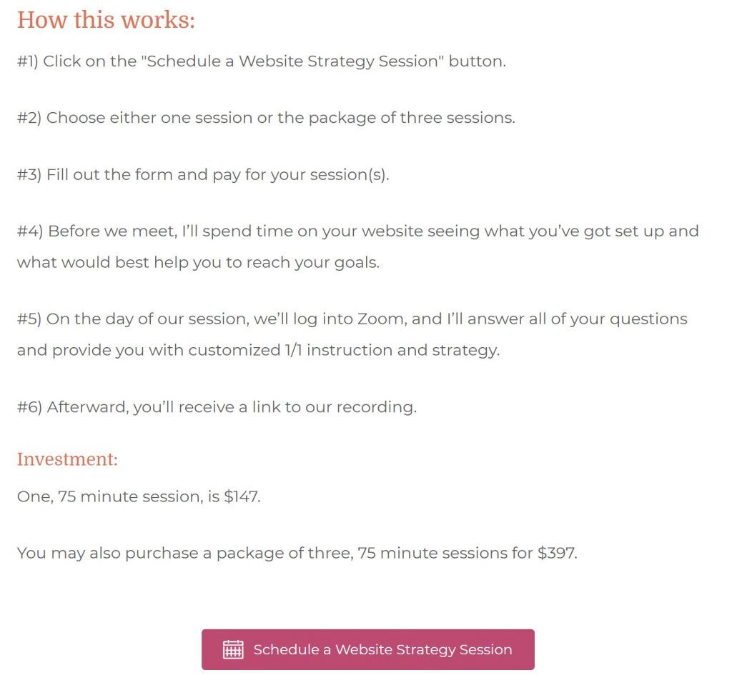
Here’s an example from my Website Strategy Sessions page:
We are so close to what we do and how our systems work that sometimes we forget that nobody else knows our business like we do, so explain it. Clearly. In this noisy online world, clear and succinct communication is a valuable commodity.
Problem #4 – Cluttered DIY design
Your design elements, like your colors and fonts, should also connect with your visitors. If design isn’t your “thing,” don’t worry. Make your motto, “simplify” and you’ll be fine.
I’ve seen websites with fourteen different fonts (yes, I actually counted) and a rainbow of inconsistent colors and patterns. These sites can feel busy, cluttered, and worse, unprofessional.
For your fonts, choose two:
- A body font that all of your text will be written in
- A header font that you will use for blog posts and page titles
Be SUPER consistent with your use of fonts; this will give your site a professional, clean feel.
For colors, settling on ONLY 2-3 colors is KEY to a professional design.
Choose colors that appeal to your target market. For example, if your target market is new, exhausted working moms, choose calm and peaceful colors, not black and red.
Again, stick with these colors for a consistent, professional look. When you start getting crazy with colors, fonts, and patterns, your site begins to lose that professional feel which will impact the trust and credibility factor.
Conclusion
The #1 goal of your website is to connect with your target market and convert visitors to clients and customers. That’s it.
To do this, SIMPLIFY!!!! Focus on your messaging and connecting with people through your words and your design choices.
If you feel like you need a little more support or if your website is suffering from any of these issues, but you aren’t sure how to fix them, we can get your site squared away with a website strategy session.
Once you’ve got your website set up to convert those visitors, it’s time to start marketing the heck out of it and getting those visitors to it!
xo,
Amy