
 On a website, color, fonts, imagery, textures, graphics, and copy all work together to create a cohesive whole that is designed to draw visitors in and connect with them.
The element that tends to jump out first is a site’s colors. As humans we notice it instantly and associate feelings and emotions with the colors we see.
Choosing your brand colors or the colors for your very first website before you even have a full-on brand can be super fun but also a little overwhelming. The key to remember is to have fun with this process and also know that you can change your mind. You’re working in pixels here, not marble.
Before we dive in, I’d like to make one key point. The goal of your website and your colors is to connect with your ideal client and target market, NOT showcase your favorite colors. This isn’t your wedding, it’s your website.
Your color choices should be based on BOTH your target market AND your personality/preferences.
Even if you only wear blues and your whole house is decorated in blues, if your target market is vegetarians, you probably wouldn’t choose only blues as your colors because the only sort of blue-ish food is a blueberry. I guess if you’re the blueberry goddess go with all purpley-blues but otherwise, blue food isn’t that appealing nor will any of your food images “go” with your brand. With that said, there’s probably some super successful food guru with blue as their brand color, but I’m just using this as an example to illustrate a point.
So, let’s go through this color process by keeping your clients first and foremost in your mind.
6 Steps on How to Choose Website Colors
#1 – Open up a file or grab a piece of paper for notes
Create four columns.
In column one, list some words or feelings that you’d like to visitors to feel when they hit your site or work with you. Perhaps you want them to feel rebellious or like a risk-taker, or perhaps you want them to feel peaceful and calm.
The colors you choose will go a LONG way to conveying these feelings.
Label column two neutrals.
Under this column, write “white, lite gray, charcoal gray, black.”
Yes, we’re starting with white and neutrals.
White space and places for your visitor’s eye are to rest are important.
See what I mean? I have heard that this site is actually quite popular because it is so crazy, but unless crazy is part of your brand, give your viewers some white space.
Label column 3, primary or main colors.
Label column 4, accent or secondary colors.
The goal is to have 1 or two primary (or main) colors and 1 or 2 secondary (or accent) colors.
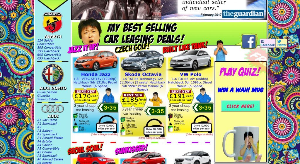
A hallmark of a hokey DIY website is to have a rainbow of colors, none of which really work together (see above). Trust me. I’ve done LOTS of web reviews of DIY sites. Narrowing down and refining your palette is key to a professional look.
#2 – Check out the Psychology of Colors
Let’s have a little chat about color and psychology. You might not know this about me, but I taught Psychology for years, read psych books for fun, and am fascinated by how our brains influence our decision making.
In fact, I have a whole Pinterest board dedicated to the psychology of color. Check it out. You might even create your own Pinterest “color” board and start pinning what you like.
There are all kinds of studies on color and marketing, so before you drill down your colors, review some of the “feelings” that certain colors evoke.
Here is a color chart on some predominant brands, the colors they use, and the feelings those colors evoke. Despite extensive searching, I was unable to find the original source for this chart to give them credit. It’s pretty cool, so thank you to whoever created it!
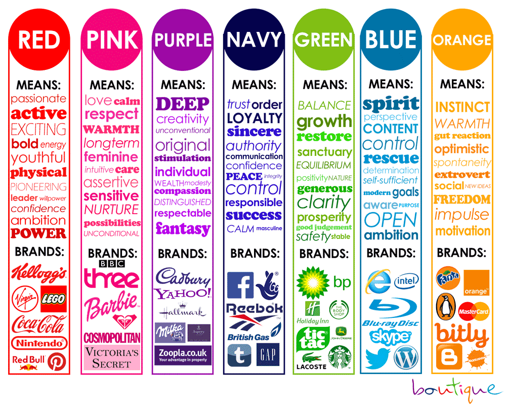
Look at the colors and the feelings each of these colors tend to evoke in people. Which colors speak to you? Which emotions surprise you?
Go back to your chart and jot down some ideas for your main and accent colors based on your preferences, your target market and the psychology of color.
Here’s how I chose the brand colors for Entwine Web Design.
In looking at the psychology of color, I went with a denim blue as my primary color, partly because I love navy, it’s the foundation of one of my favorite brands, HGTV or HagTV as my beloved hubs likes to call it. In terms of psychology, darker blue is associated with strength, trustworthiness, and dependability. I also pretty much live in jeans. I’m casual, so a dark blue/gray worked for me.
The raspberry color I chose as a secondary color because it’s one of my favorite colors. I always feel pretty when I wear bright pink. It’s fun, cheerful, and bright. I also went with pink for the pop of color rather than yellow because my target market is a woman, and I wanted to go with a more feminine touch on my site.
Lastly, I chose several shades of orange as the final colors. I love the fire-y warmth that comes from the oranges and pinks put together. Orange also has a psychology of freedom which is a core value of mine. There’s movement and growth in orange, but the super light orange is also a little soft.
Finally, I want to note that while my primary colors are two of my favorite colors, my final color choice, the oranges, aren’t necessarily favorites. But I love how they work with the navy and raspberry.
On a side note, don’t be afraid of color. For some reason, I’ve been seeing lots of black/white/beige/gold websites lately. They’re quite polished and professional and…boring without tons of personality. You can certainly use black and white as your base, but add some color. Check out Apple.com to see what I mean. They’re all black, white, and gray with pops of color and shine.
#3 – Take some notes and if you made a Pinterest board, review it
List 2-3 colors that you really like.
What jumps out at you?
Which colors work together?
Do the colors reflect the feelings that you’d like to convey on your website?
Now it’s time to start narrowing down. Remember, you might just choose three colors total. That’s GREAT. Neil Patel, an online brand who focuses on SEO and marketing, uses ONLY orange, white, and gray on his site, and I can assure you it does NOT look Halloween-ish at all.
#4 – Determine your Color Combinations Using a Color Wheel
I’m a designer and have always had a color wheel laying around, but if you don’t, no worries. I’ve got one pinned on Pinterest, or you can find a good one here.
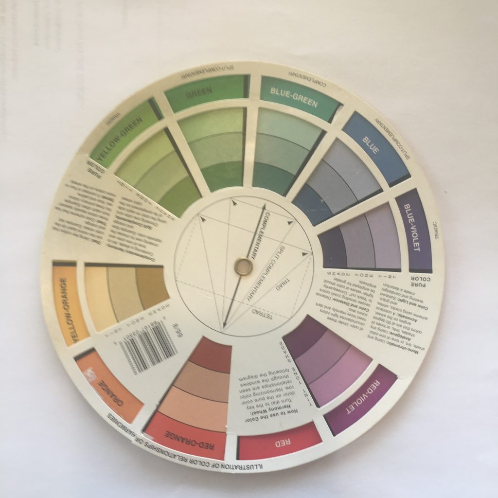
Here’s a pic of my tried and true color wheel.
The color wheel will give you suggestions as to how to combine colors. You can do it in several ways.
Complementary colors fall directly across the color wheel from one another, and these are usually super common color combinations like red/green, blue/orange, purple/yellow.
If you don’t like so much contrast, you can go with a monochromatic palette, which means you’re picking colors from one color family.
For example, you might use dark purple, lavender, and pale purple for your palette. Then, to punch it up, choose a yellow, purple’s complement, for an accent color for your buttons.
Monochromatic color palettes tend to be calmer and more peaceful because of the lack of contrast. Think of a website that just uses dark teal, medium teal, and a light turquoise. It would have a calmer feeling than one with lots of pops of different colors.
To choose a monochromatic palette, you’d choose one of the columns on the color wheel and stay there. For example, you’d choose the red-violet piece of pie and just use the colors in that section.
An analogous color choice also has less contrast as you’re choosing colors that are right next to each other on the color wheel. This might be a choice of red, red-orange, and orange. The opposite of that would be a blue-green which would be great for a contrast. Or, if you want to stick with that color family, you’d choose a much darker shade of one of your colors for an accent color.
So how does this color theory apply to you?
You want to choose colors that work well together, not just random colors that you like. You also want to limit your color palette (or go big with color like the car site above).
For example, Entwine Web Design’s palette uses analogous colors with the red/pinks, oranges, and yellow. The navy is a complement and directly across the color wheel. Look at the logo at the top of the page and you’ll see what I mean.
Now, look back at your list of colors and jot down some pairs of colors that work well together.
#5 – Choose Your Primary and Your Secondary Colors
Now it’s time to narrow your palette down.
What color(s) will be the star of your website? Choose 1-2 and list them or circle them in your notes.
Which colors will be the accent colors? Choose 1-2 and list them in your notes.
Go back to the color wheel and make sure that you’re using colors that work well together in terms of color theory and where they fall in relation to one another on the color wheel.
#6 – Choose Lights and Darks of each of your colors
Once you’ve chosen your colors and narrowed them down a bit with the color wheel, you want to make sure you’ve got both light and darks.
A shade of a color is when black is added to make it darker. A tint is when white is added to make it lighter. You want lights, mediums, and darks.
These might be the same color or they might be different colors. It doesn’t matter, but you need all three: lights, mediums, and darks.
You’ll use the darker and medium tones for headlines, buttons, backgrounds, and accents.
You’ll use the lighter tints for backgrounds, hover effects on buttons, and text on darker backgrounds.
Some examples:
Here are Entwine’s brand colors. You’ll note the colors move from dark to light. My primary colors are dark raspberry, the navy, and the super light gray. I also consider white a primary color. The lighter pink and orange are accent colors. I rarely use the yellow color, but it works for an occasional pop of color.

These bottom two rows are brand colors for clients. You’ll note that I almost always have shades of black white and gray in a set of colors. You don’t have to use those colors, but they work as neutrals and generally, the text is written in gray or black, so I like to include them.
This set of colors is for Jamie Metz, a leadership and corporate coach for women. She has strong, bold pinks as she works with women, but she also has the much softer taupes and greens which conveys the safe space she creates for her clients. She also LOVES the outdoors and has hiked the Camino and across Scotland, so we honored that piece of her with the outdoorsy colors.
If you look at the color wheel, the yellow-greens fall exactly across from the red-violets which is why they work so well together.

This set of colors is Brittney Stefanic’s brand. Brittney is a sleep consultant working with families, babies and children. She did NOT want the traditional blues and pinks that “go” with babies, so instead, we went with soft, calming blue-greens with a pop of peachy-orange for contrast.
Again, looking at the color wheel, the blue-greens are opposite red-orange. Now, did I go into color theory when I shared potential color options with these clients? No, but all of the options I gave them were grounded in color theory and based on an understanding of what colors work together.

Conclusion
If choosing colors overwhelms you, choose a dark, medium, and a light shade of ONE color, a monochromatic palette, that conveys the overall feeling you’re going for and stick with that. Be consistent with it, and it will work really well.
If you’re afraid one or two colors might be boring or unsuccessful, think about Facebook and their ONE shade of blue or CocaCola and their ONE shade of red – nobody would ever argue that using a single color has held either of those businesses back.
Have fun with your colors, and remember to limit them. A color palette that you stick to on your website will go a LONG way to conveying a professional feel on your site.